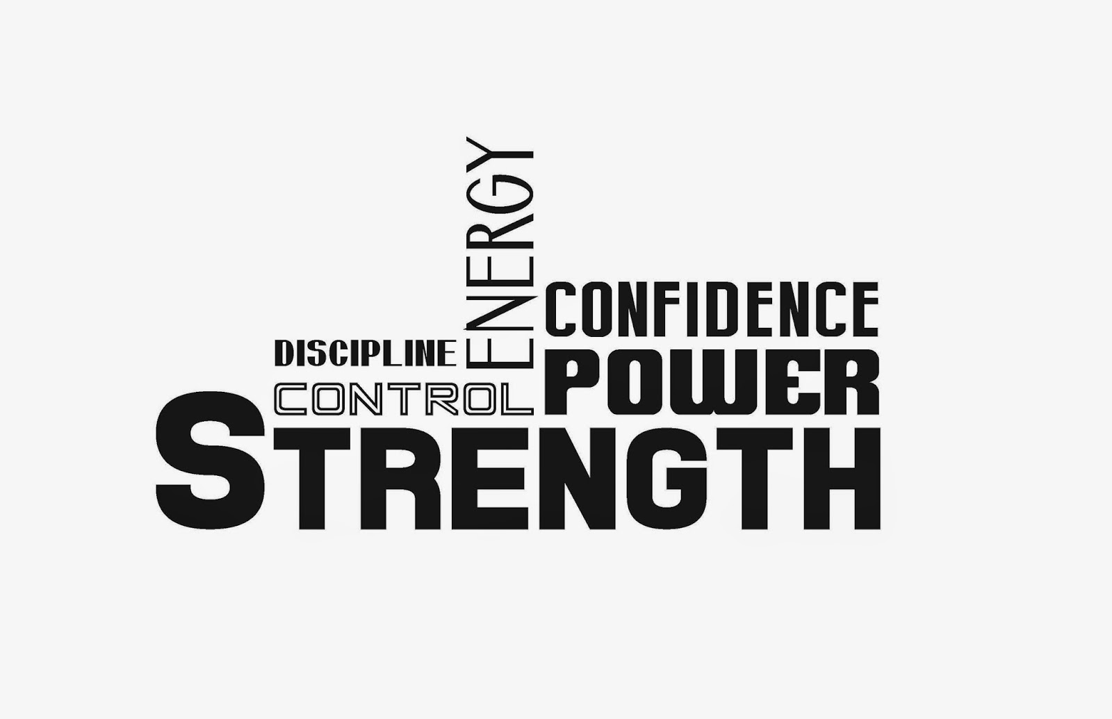
When I got the Strength Logo project I immediately knew what it needed to look like. I loved adding the arms (even though we decided it looked more of like a gym shirt than a martial arts theme) it screamed strength but the final logo was the original one drawn up.
Samples
Final Logo
Shirt Layout
*Printer update: Changed and printed in silver*


No comments:
Post a Comment